Bonus content! Here are five more easy ways to take your presentations from “blah!” to “ahhhh.”
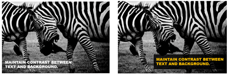
Tweak #1: Maintain Contrast Between Text and Background
Not only do you need contrast for your content to be readable, but too little contrast can also make your slide look flat and muddy. If you need to put text on top of an image, increase the contrast by putting a semi-transparent bar of color behind the text (as shown on the right.)
 Tweak #2: Don’t Let Your Presentation Compete With You
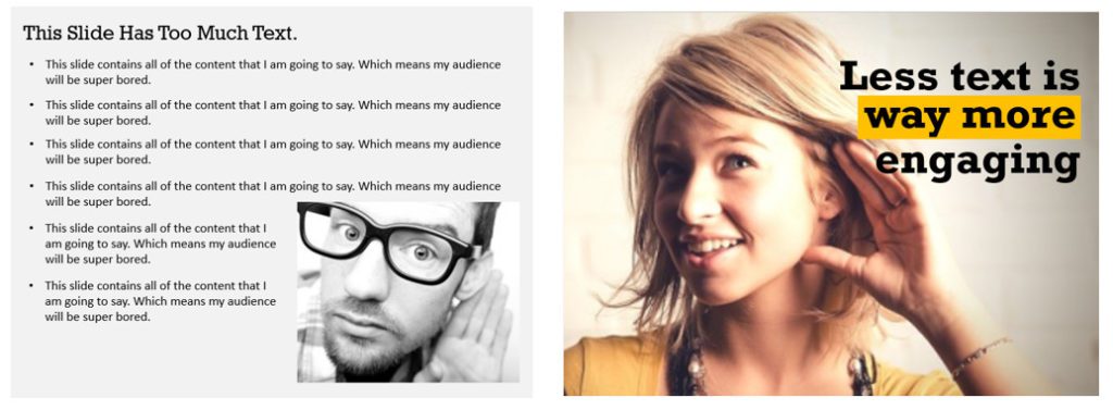
Your slides are not your content—they are your content enhancers! Content-heavy presentations lead to one of two problems:
- The slides contain everything the presenter is going to say, which makes the presenter redundant and causes the audience (especially fast readers!) to get bored.
OR
- The slides compete with what the presenter is saying, and the audience’s focus is split between the presentation and the speaker.
To avoid both problems, keep your slides simple and text-light. Allow your slides to be “jumping off points” for discussion.
 Tweak #3: Align All Presentation Elements
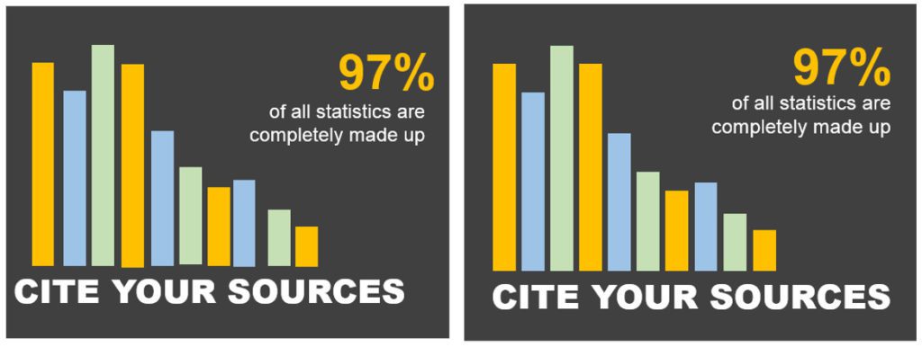
Better alignment of photos and texts is an easy way to “face lift” your slides. This small tweak may seem nitpicky, but look at the difference!
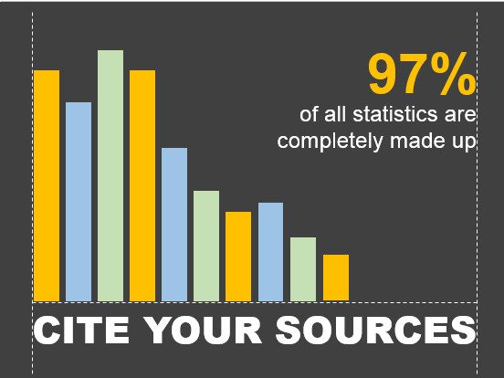
To make sure that your elements are properly aligned, try drawing lines temporarily on your slides—you can remove them once you’re confident that everything is lined up properly.
 Tweak #4: Inspiration from Professional Presenters
It’s never a good idea to use the stock templates provided by PowerPoint. They are both overused and generally unattractive. But you can get inspiration from (or even purchase) amazing decks from people who do this professionally. One of my favorite sites to browse is slideshop.com. I’ve purchased a few decks from them, and also browsed for layout ideas and inspiration. (I have no affiliation with this site, and won’t make any money if you decide to use them.)
 Tweak #5: Leave ‘Em With Something Extra
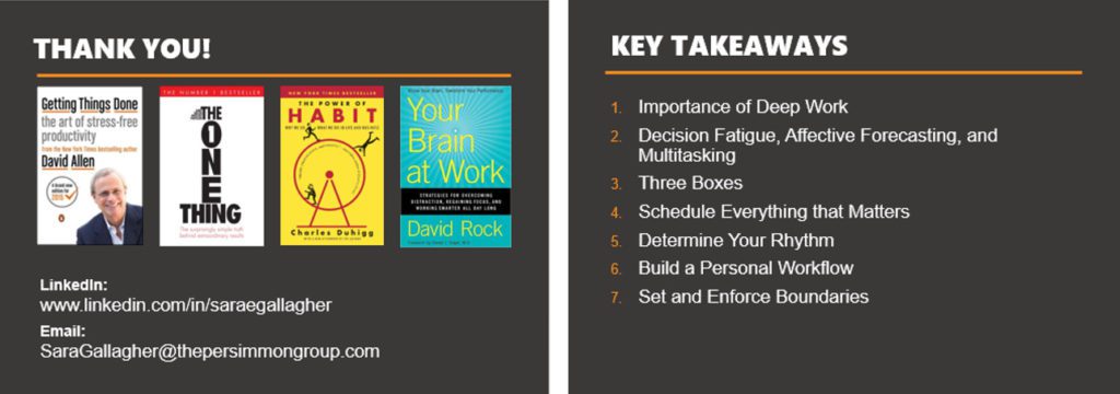
If your presentation is a training or speaking engagement, consider adding a final slide with additional resources or reading suggestions. You may also think about a “Key Takeaways” slide to use as a memory aid. Keep the layout simple, and be sure to include your contact information so participants can keep in touch.
 Tweak #2: Don’t Let Your Presentation Compete With You
 Tweak #3: Align All Presentation Elements
 Tweak #4: Inspiration from Professional Presenters
 Tweak #5: Leave ‘Em With Something Extra


