6 Simple Tweaks to Enhance Your Presentations Visually
You don’t have to be a professional graphic designer to create powerful visual presentations. It’s a good thing too, since everyone from top-level executives to project leaders is expected to talk about their work from time to time, and a poorly constructed presentation can cause even great ideas to fall flat. But just a few simple tweaks can take your message from “eh” to “ahhhh!”
Tweak #1: Use Serif Fonts Appropriately
Serif fonts form a “visual rule” at the top and bottom of all characters, making it easier for the eye to follow each line of font. Because of this, they are great for extended reading (e.g. long paragraphs or explanatory blurbs beneath a graph or charts.) Sans Serif fonts (as their name implies) do not have serifs; they are simple and uncluttered, making these fonts perfect for bold headlines and bullet points.
To see the impact that appropriate font use makes, take a look at the slides below. Which is more effective?
 Tweak #2: Differentiate Font Size to Make Your Point
In business, it is tempting to make your headings as large as possible. But remember, the goal of the slide is to communicate, not simply display information. Take a look at the two slides below. Which does a better job of communicating the presenter’s point?
 Tweak #3: Leverage Negative Space
Negative space is area that is not filled with words, images, or other content. Negative space can be used strategically when you want to be provocative, impactful, or simply give the audience some “breathing room” to refocus their attention after a series of content-heavy slides.
 Tweak #4: Tell Stories with Images
People remember stories, not bullet points. If you want to make an impact, omit text in favor of a single powerful image.
 Tweak #5: Aim for Consistency over Uniformity
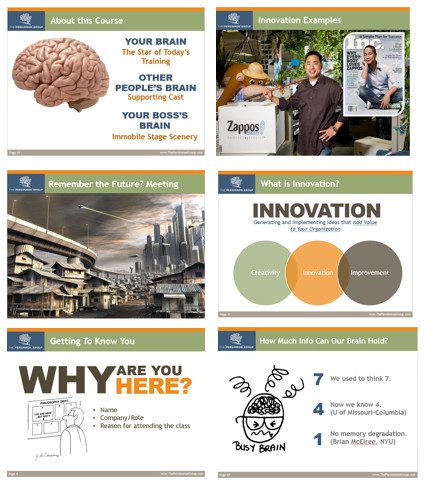
Great presentations will have a consistent “look” from slide to slide. But a good template doesn’t have to mean fifty slides of boring! Take a look at the five slides below. All appear to “belong” to the same presentation, yet each is uniquely configured to communicate a specific point.
 Tweak #6: Use a Palette Tool to Choose Your Colors
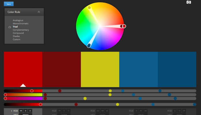
Color is one of the key areas where presentations fall apart visually. Unfortunately, finding the right colors takes a certain level of artistic intuition that many busy executives don’t have. But did you know that there are free, fool-proof tools you can use to select a beautiful color palette for your presentation…without the hassle? My favorite is Adobe’s Color CC tool, which you can find here.
To begin, find the “RGB” (Red, Green, Blue) values for the dominant color in your company’s logo. (Here are some instructions on how to do this using Microsoft Paint, which comes standard on most computers.) Now, in the Adobe color wheel program, look for the color box with the white triangle. This is your “base color.” Enter the RGB values for your logo into the fields below your base color box (see the yellow arrow.)
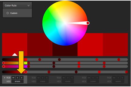
Too much work? The tool also provides a “create from image” option, which can build a palette based on a screenshot of your logo or website.
Want more tools and insights to take your performance to the next level? Visit our Insights and Tools for continuously updated content. Also, look for next week’s blog post, “5 MORE Simple Tweaks to Enhance Your Visual Presentations.”
This post has been updated from the original version posted on May 30th, 2016

 Tweak #2: Differentiate Font Size to Make Your Point
 Tweak #3: Leverage Negative Space
 Tweak #4: Tell Stories with Images
 Tweak #5: Aim for Consistency over Uniformity
 Tweak #6: Use a Palette Tool to Choose Your Colors